"Pure style is my way of life... a blueprint for living in the 21st Century"
Blue highs
04 March 2013
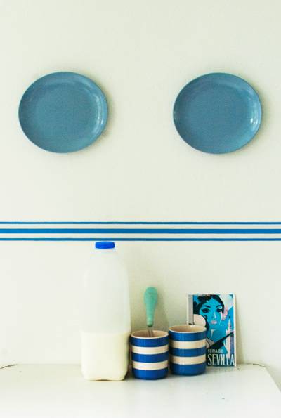
The psychoblurb where blue equals down, miserable.... blah blah blah is daft, really. When I get the blues, it all feels rather ragged London pigeon grey. Rippling cobalt blue sea or a first day of spring blue sky can only help to lift my mood. So pleased to see on the Style Court blog that although the Pantone colour of the year is Emerald green, there`s much to get excited about blue, too. How about the new blue and white ceramics exhibition at the Boston Museum of Fine Art, the cobalt blue cover of the new Anthroplogie spring collecton or Cornflower one of my new Colour Band borders - see above ?
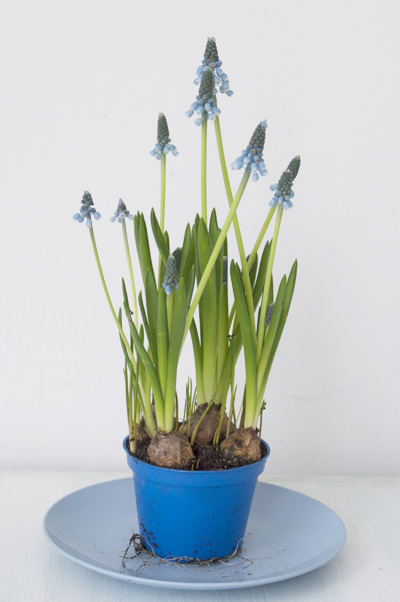
More highs: his little pot of grape hyacinths is just as I found it at the local flower shop perfectly co-ordinated with blue plastic pot for 1.50 and, so far, 10 days of indoor Spring beauty.
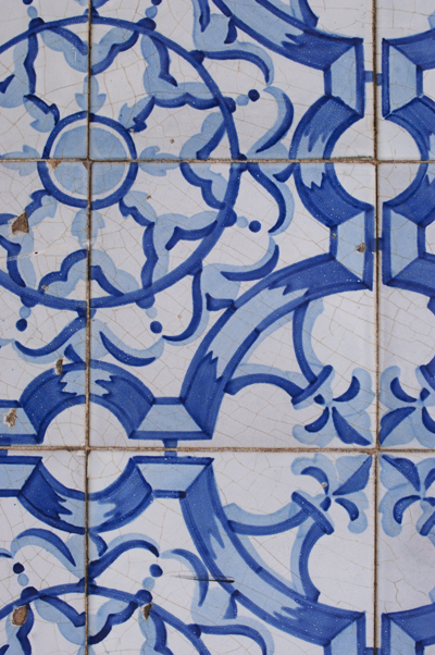
Cobalt blues on old Portuguese tiles, a street feature in Olhao as everyday as grilled sardines .
Funny, isn`t it that this gorgeous sludgy blue in my sitting room is called Parma Gray? At night it feels snug, along with the heat from the new Morso woodburner. (Yes, yes, yes, pluck me from the Periodic Table of the Middle Class Handbook ). During the day this colour is serene, all very period Dutch domestic interior, like being in a scene from the Girl with the Pearl Earring. Nothing depressing about that.

Tags: colour, spring, blue, paint, bulbs, colour band
Categories
autumn
frost
garden
homecooking
recipes for every day
scent
simple
simpleliving
spring
valentine
winter
alliums
apples
archtiecture
athome
autumn
autumn crabapple jelly resourceful
baking
barbados
basil
blankets
blankets colour texture roses
blossom
blue
bluebells
books
bulb
bulbs
butterflycakes
cake
chocolate
christmas
coast
colour
colour
colour band
comfort
competition
coronavirus
cotton
country style
countryinthecity
covid
covid-19
crabapple jelly
danish design
decoration
domestic bliss
ecogarden
everyday beauty
fabric
fabrics
floral fabrics
flower power
flowerpower
flowers
frost
functional
garden
garden
garlic
get crafty
golden
green
growing
hazelsticks
holiday
home cooking
home cooking
homecooking
homemade
homesewing
interiors
interiors. decoration
lido
lilac
lime green
linen
lockdown
lockdowngarden
londonreatreat
londonretreat
market
market
marmalade
melbourne
narcissi
natural
natural fabrics
olhao
olives blue summer
onions
orange
outdoors
paint
painting
pandemic
paper borders
pink
portugal
puglia
pumpkins
pure style borders
purecolour
purestylecolour
purple
rhubarb
rio
roses
runnerbeans
scent
september
sewing
shed
simple
simple decoration
simple decoration
simple design
simple update
simple-eating
simple-living
simpledetail
simplegarden
simplegardn
simplestyle
simplestyle
spain
spring
spring
springcolours
springgarden
stockholm
stripes
style
summer
sunflowers
sweden
swimmming
thrifty decoration
ticking
tidy
tiles
tulips
tulips. japan. location shoots
verbena
wallpaper
white
white paint
white rooms
wigwams
wildflowers
winter
winter
winter simple decoration white retro vintage
winter. home cooking
yellow
yellow
Archives
I like
Website design by ph9
autumn
frost
garden
homecooking
recipes for every day
scent
simple
simpleliving
spring
valentine
winter
alliums
apples
archtiecture
athome
autumn
autumn crabapple jelly resourceful
baking
barbados
basil
blankets
blankets colour texture roses
blossom
blue
bluebells
books
bulb
bulbs
butterflycakes
cake
chocolate
christmas
coast
colour
colour
colour band
comfort
competition
coronavirus
cotton
country style
countryinthecity
covid
covid-19
crabapple jelly
danish design
decoration
domestic bliss
ecogarden
everyday beauty
fabric
fabrics
floral fabrics
flower power
flowerpower
flowers
frost
functional
garden
garden
garlic
get crafty
golden
green
growing
hazelsticks
holiday
home cooking
home cooking
homecooking
homemade
homesewing
interiors
interiors. decoration
lido
lilac
lime green
linen
lockdown
lockdowngarden
londonreatreat
londonretreat
market
market
marmalade
melbourne
narcissi
natural
natural fabrics
olhao
olives blue summer
onions
orange
outdoors
paint
painting
pandemic
paper borders
pink
portugal
puglia
pumpkins
pure style borders
purecolour
purestylecolour
purple
rhubarb
rio
roses
runnerbeans
scent
september
sewing
shed
simple
simple decoration
simple decoration
simple design
simple update
simple-eating
simple-living
simpledetail
simplegarden
simplegardn
simplestyle
simplestyle
spain
spring
spring
springcolours
springgarden
stockholm
stripes
style
summer
sunflowers
sweden
swimmming
thrifty decoration
ticking
tidy
tiles
tulips
tulips. japan. location shoots
verbena
wallpaper
white
white paint
white rooms
wigwams
wildflowers
winter
winter
winter simple decoration white retro vintage
winter. home cooking
yellow
yellow
Archives
I like


